Just recently a lot of countries around the globe have entered into a “second wave” of Covid-19 cases. Do we need to be as worried as earlier this year when the first wave of the pandemic arrived? What can statistics tell us about fatality of Covid 19 infections? Being data-driven we could not resist to analyze the figures available and share this example with you.
Let’s skip the introduction, we are all alarmed by Covid-19 data and are observing all new numbers and data with tension. No need to explain the situation. We start straight away with the data[1].
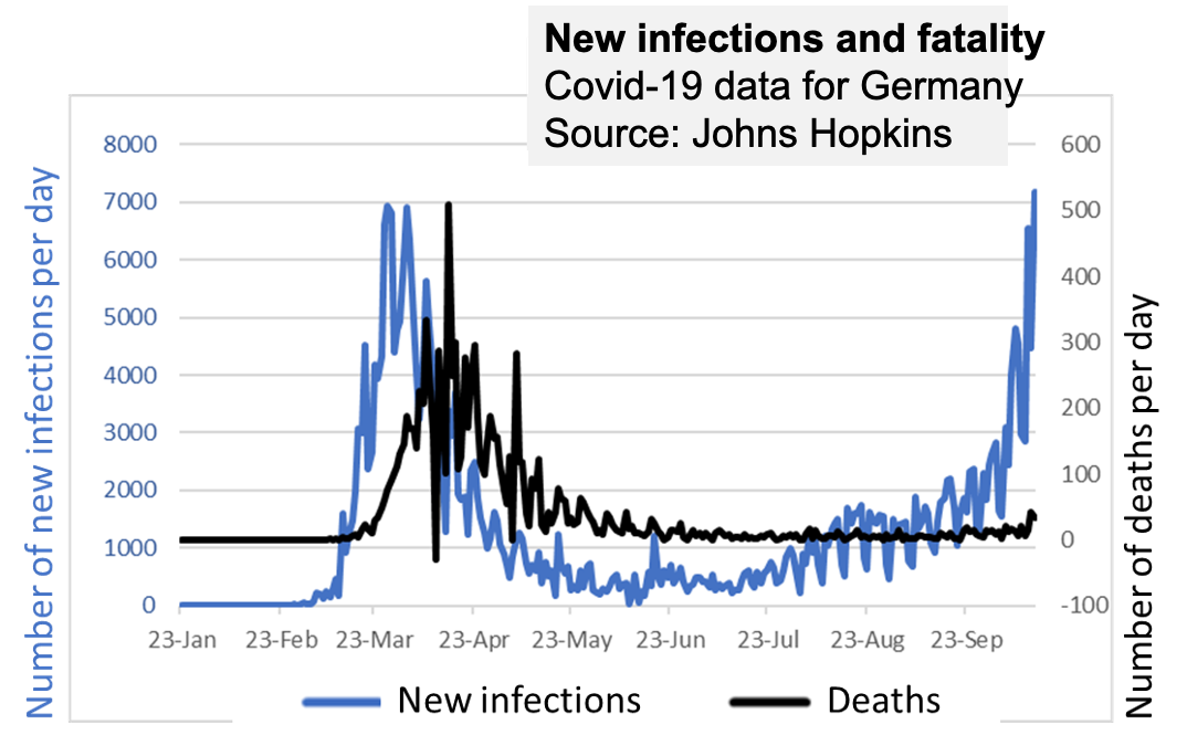
These are the new infections in Germany and the fatalities at the same day (please note that there are two scales on the vertical axis on the same graph):
Based on the data we have generated a prediction model for the fatalities. In our model we considered the time from March 1 to July 30 to generate a prediction model. Obviously, it is unlikely that the new reported cases on one day correlate high with the confirmed Covid-19 deaths at the same day, but there is a delay that need to be factored in. We ran various scenarios and found that there is a very strong correlation between reported new infections and fatalities 13 days later. If the context would not be about human life every statistician would be happy about such a precise model:
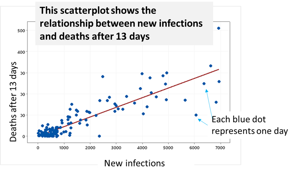
For statistic nerds: The regression equation is very basic: D13 = 0.04558 x NewInfections. With R-sq = 85%.
Explained for non-statisticians in plain English: The number of Covid-19 fatalities can be predicted to be 4.6% of the new reported infections 13 days later. And this is 85% accurate. Accuracy of 85% tells us that in average the predictions are 15% wrong, sometimes above, sometimes below. Or, that in 85% the prediction is correct.
The model tells us, that 13 days after infection 4.6% of the people tested positive died.
Can we be sure this is true?
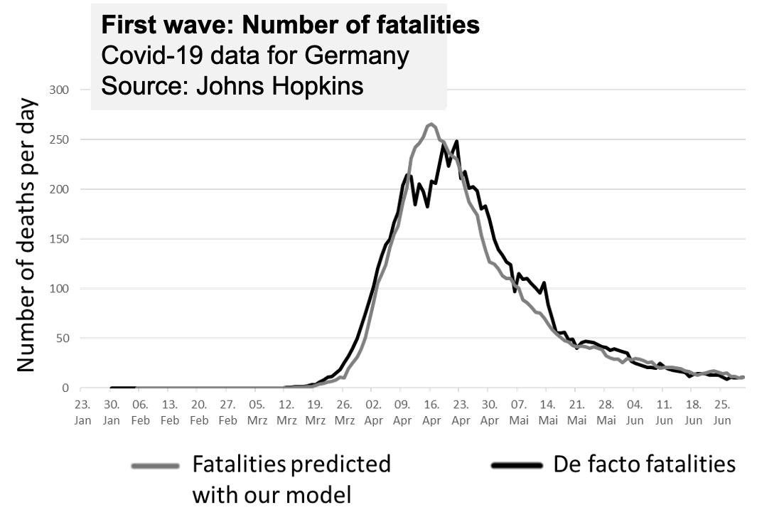
Here we have charted the moving average[2] of fatalities per week (black are the actual data, grey are the statistical predictions with the model). We can see how well these curves fit. So, the answer is: Yes, we are sure our model was good to predict fatalities in the first wave.
Please note: It can be very easy to demonstrate statistical results also to people who are not statistically versed.
And here comes a very good news: Applying the same model also to the new infections which are now rising again you can spot a significant difference:
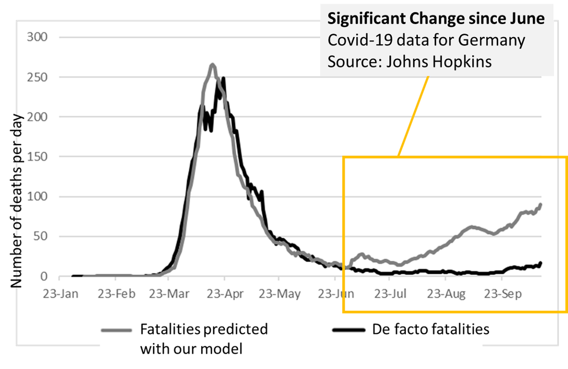
Yes, the numbers of new infections are not related anymore to the number of deaths. While the “second wave” of new recorded infections may even seem higher than the first wave it looks like there is no actual effect on the fatalities. Fingers crossed!
Fatalities deviate from predictions by a factor 1:6 to 1:10. And there is no real correlation anymore between new infections and deaths. To be clear: The deaths cannot at all be predicted building on the new infections. There seems to be no correlation. And they are much lower.
First of all this is very good to find.
Second, we can conclude there is a change of process. These data of course do not tell us about what has changed. It could be for example:
However, this is not about verifying what created the change of process but showing that there is a change.
However, data prove there was a change in Germany. Same applies to many other countries.
In case you need some tips and advice how to do this analysis with data from your country or your region, we are happy to help. Please contact us: statistics@oconsulting.com.
[1] We are using the Johns-Hopkins data available at https://github.com/CSSEGISandData/COVID-19/tree/master/csse_covid_19_data/csse_covid_19_time_series updated on October 15, 2020
[2] To smoothen the line and avoid the steep up-and-down of the actually reported data we have used the average of the last 7 days for each day.